Overview
Physiosync is an iOS app for patients undergoing physiotherapy treatment. Within the app, physiotherapists can assign tailored videos with movement examples to patients to develop habitual progress in their recovery. With guided movement instant messaging, Apple Watch integration and machine learning for exercises, the app will allow patients to monitor their progress as they learn to exercise correctly alongside their therapist digitally.
My Role
Deliverables
Team
Problems
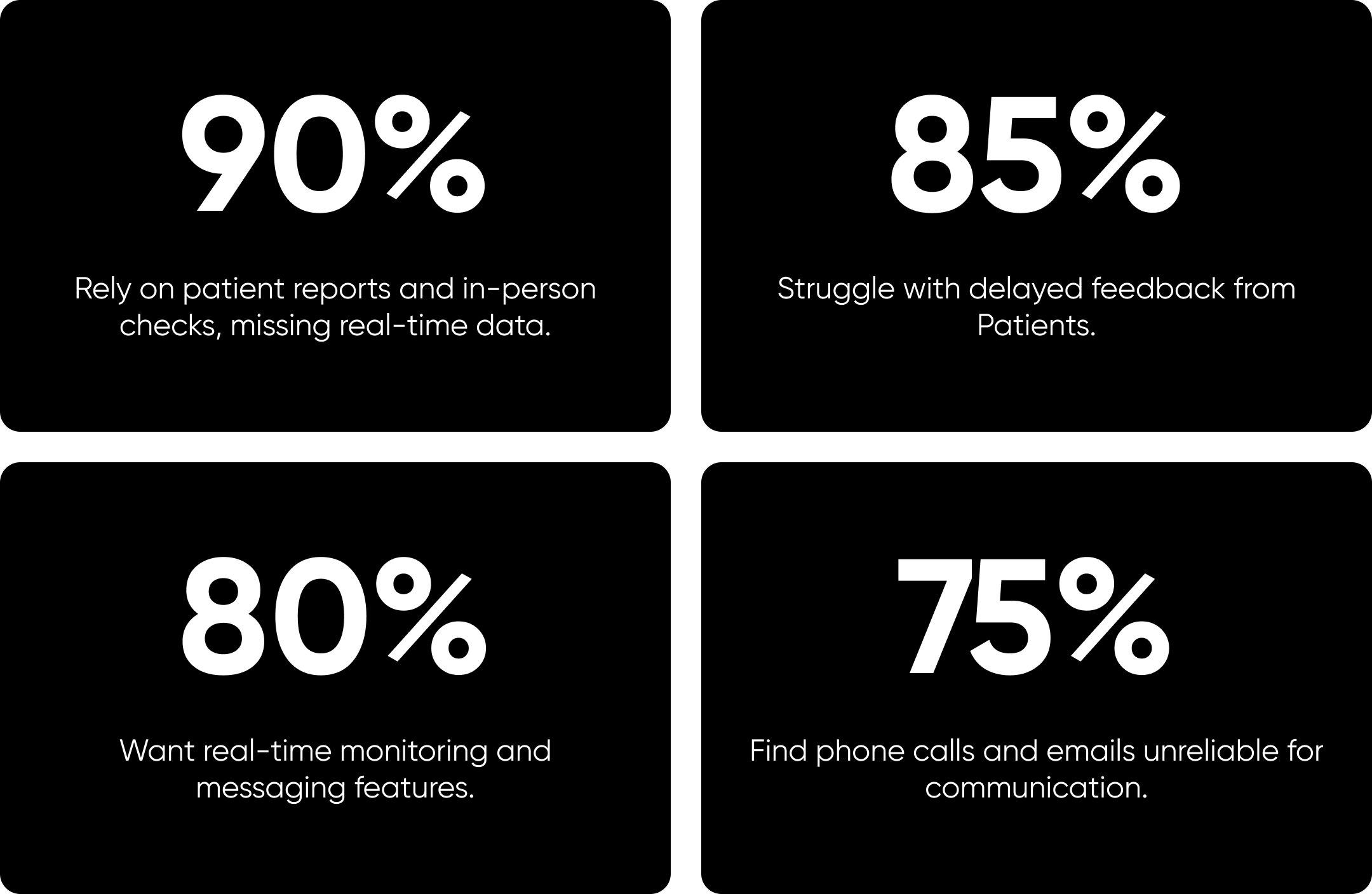
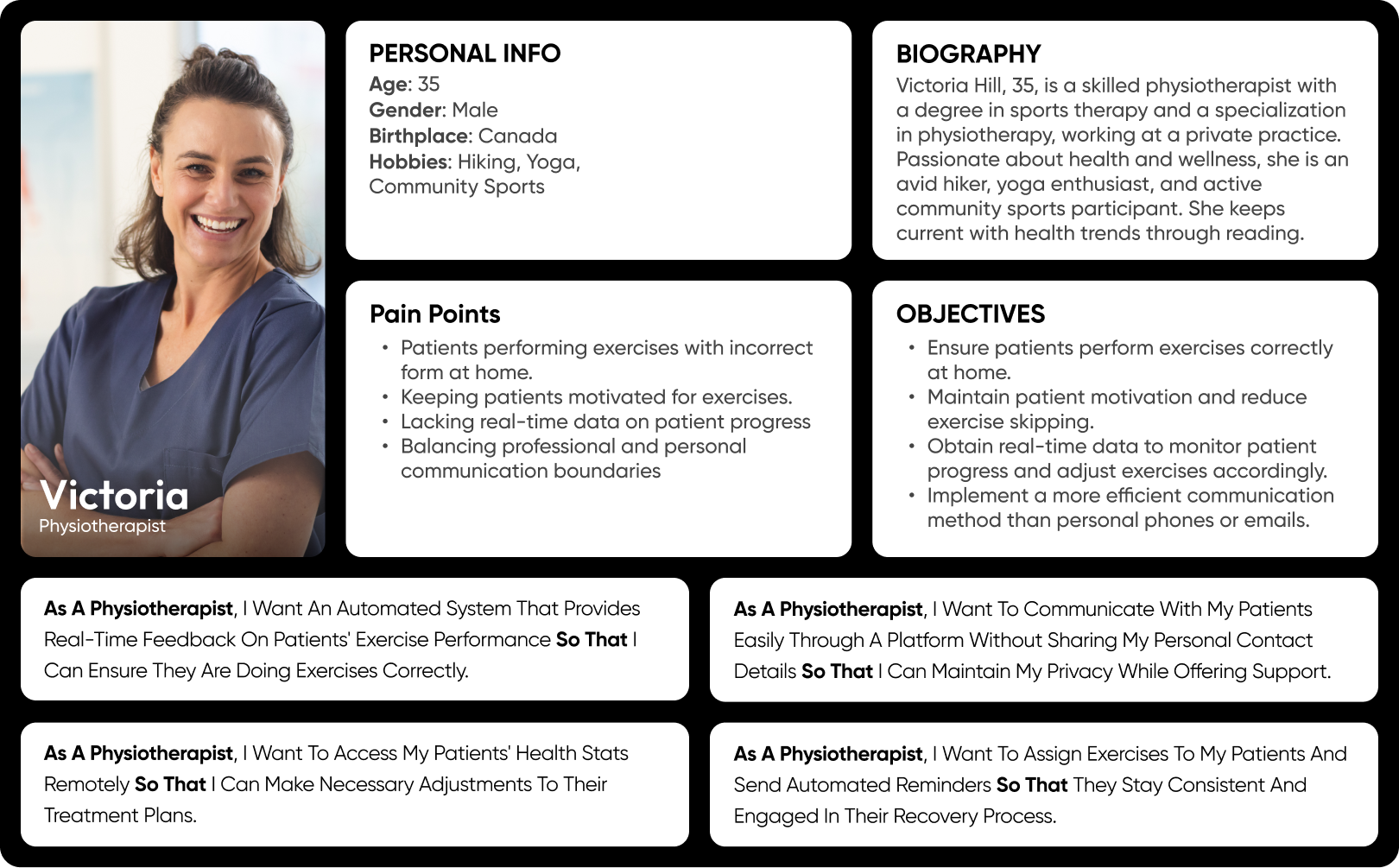
Therapists
- Limited Visibility and Real-Time Data: Therapists can’t see how patients perform exercises at home, making it difficult to assess progress and adjust treatment plans. Without real-time health stats, optimizing exercise schedules to aid faster recovery is challenging.
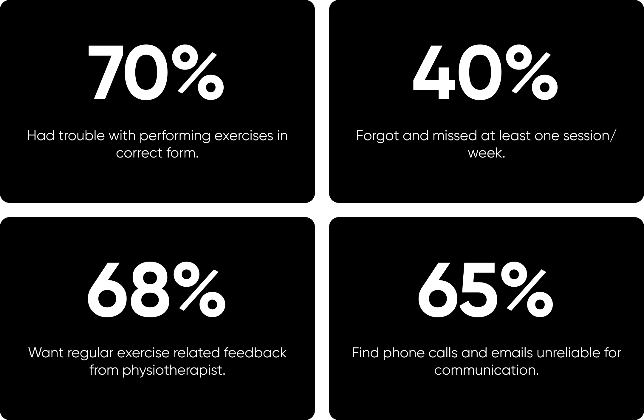
- Limited Patient Engagement: Patients often forget to exercise and lack the motivation needed for consistent physiotherapy due to insufficient reminders and support. This low engagement can significantly hinder their recovery progress.
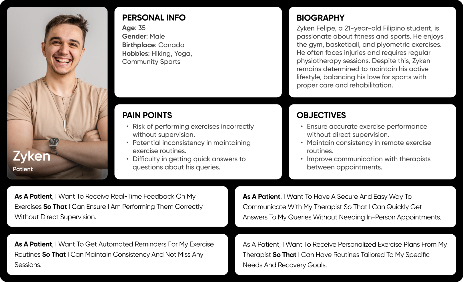
Patients
- Communication Gap: Limited therapist availability and infrequent appointments create communication barriers, hindering timely adjustments and potentially compromising patient care.
- Exercise Accuracy Without Supervision: The unsupervised nature of many physiotherapy exercises increases the risk of improper form, potentially compromising treatment effectiveness and increasing the risk of injury.
Design Process
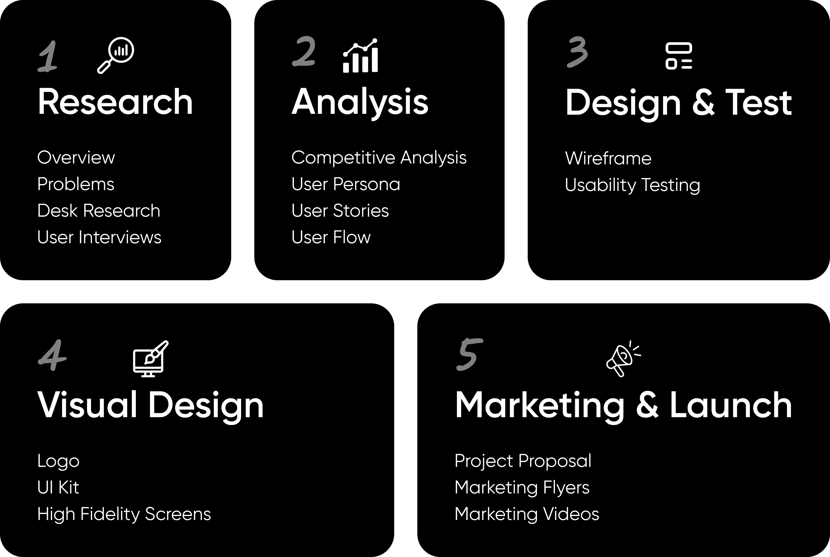
Research
Desk Research
We conducted intensive market research by reading various articles and understanding research papers to gain a comprehensive understanding of the physiotherapy landscape. This thorough investigation helped us identify key trends and challenges in the field.
Key Findings
45% of physiotherapists used remote therapy during lockdown, up from 4.9%.
71% of physiotherapists reported relying on telephone calls for remote services.
58% of Physiotherapists struggled to access and provide feedback to patients.
User Interviews
Therapists
Through our desk research, we identified many challenges faced in the physiotherapy space. However, to get a clearer picture of their specific needs, we decided to interview actual physiotherapists and patients. These interviews provided valuable insights that helped us understand which features would be most beneficial and how to tailor our solution to meet real-world demands.
Patients
To make sure we were building an effective bridge between physiotherapists and patients, we also needed to understand patient needs. Therefore, we interviewed a few patients undergoing physiotherapy. These conversations gave us crucial insights into their experiences, challenges, and preferences, ensuring our solution addresses the needs of both therapists and patients effectively.
Analysis
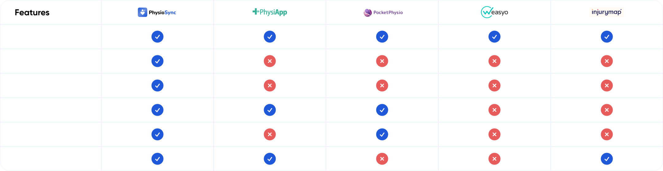
Competitive Analysis
Next, we analyzed competitors in the current market to see what they are doing and identify areas for improvement. This competitive analysis allowed us to pinpoint gaps and opportunities, ensuring that our solution not only meets but exceeds the existing standards in physiotherapy care.
User Persona & User Stories
Creating personas was essential to ensure our design decisions were deeply rooted in the real needs and behaviours of our target users, allowing us to create solutions that truly address their challenges and enhance their experience.
Physiotherapist Persona
User Flow
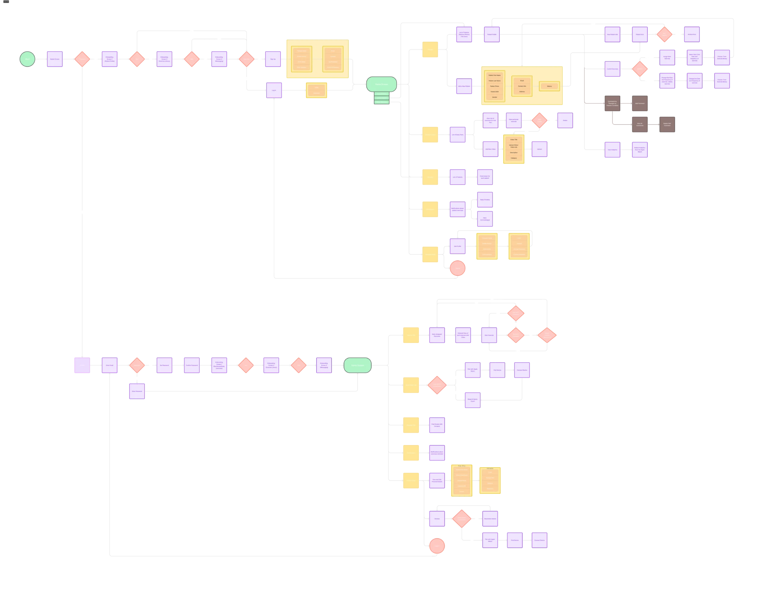
Once the persona was ready, we used it to create user flows, ensuring a smooth and intuitive experience based on their needs and behaviours.
Design & Test
Wireframes
We created wireframes to visually map the app’s structure, layout, and user navigation flow.
Usability Testing
We conducted usability testing to identify any issues users might face while interacting with the app, allowing us to refine and improve the user experience based on real feedback.
Usability Testing Process:
- Participants: 8 (2 physiotherapists, 6 patients)
- Method: Task-based testing with think-aloud protocol
- Duration: 15-30 minute sessions per participant
- Key metrics: Task completion rate, time on task, error rate, and user satisfaction (measured by SEQ)


Usability Testing Findings and Improvements
1. Frustration During Long Video Uploads
5/6 of patients found the video upload process frustrating
Before
After
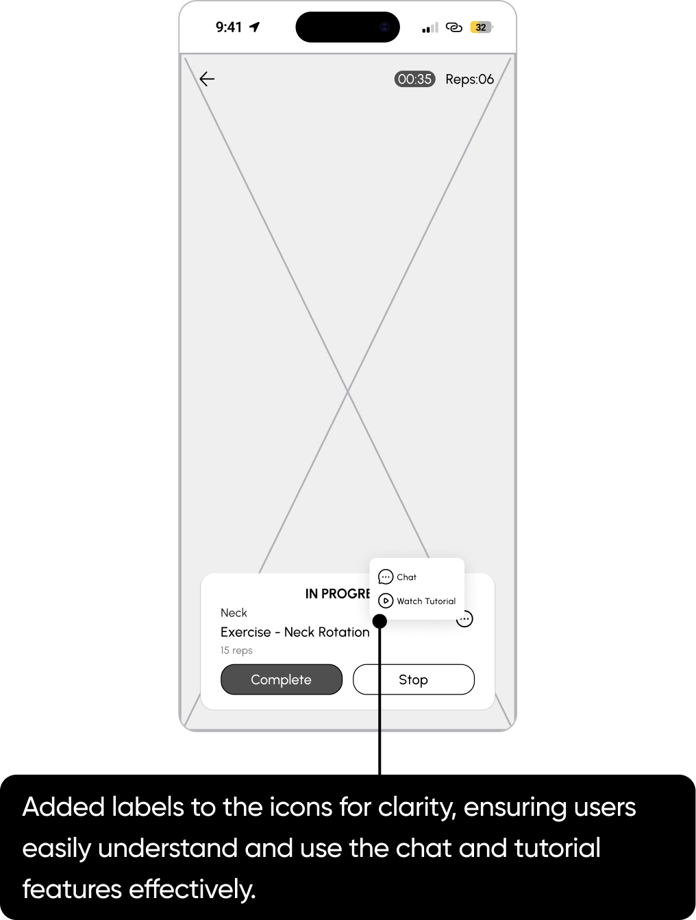
2. Unclear Icon Functions
6/6 users misunderstood or overlooked the chat and tutorial icons
Before
After
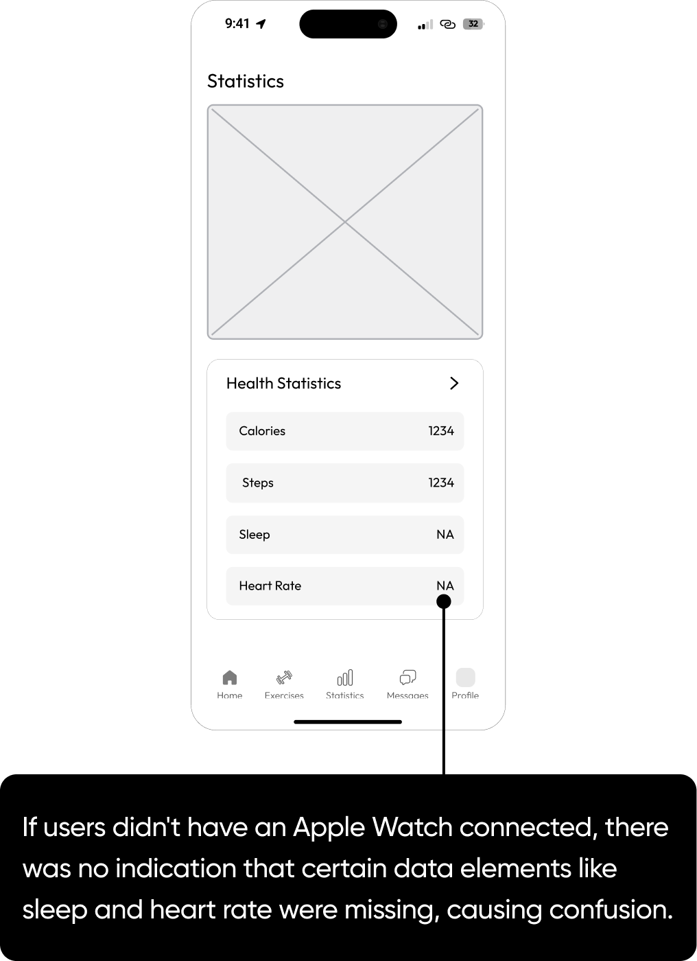
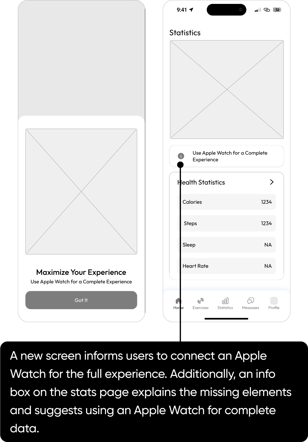
3. Notifying Users of Apple Watch Dependency
2/6 users were confused by missing data when not using an Apple Watch
Before
After
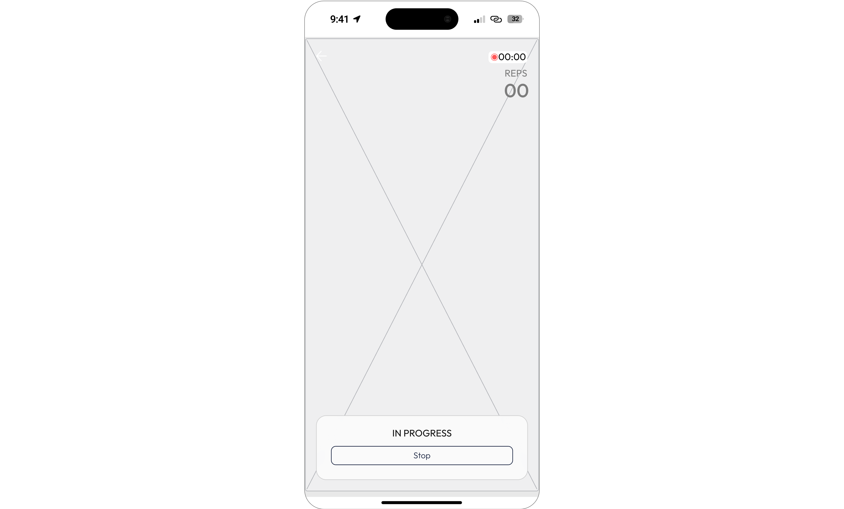
4. Innovating Exercise Tracking Beyond Screens
4/6 users had to go back to see the exercise instructions, which caused a hindrance in their workout.
Before
Users performing exercises away from their phones found it hard to see their rep count, causing inconvenience and disrupting their workout.
After
Users performing exercises away from their phones found it hard to see their rep count, causing inconvenience and disrupting their workout.
Visual Design
Branding & UI Kit
Typeface
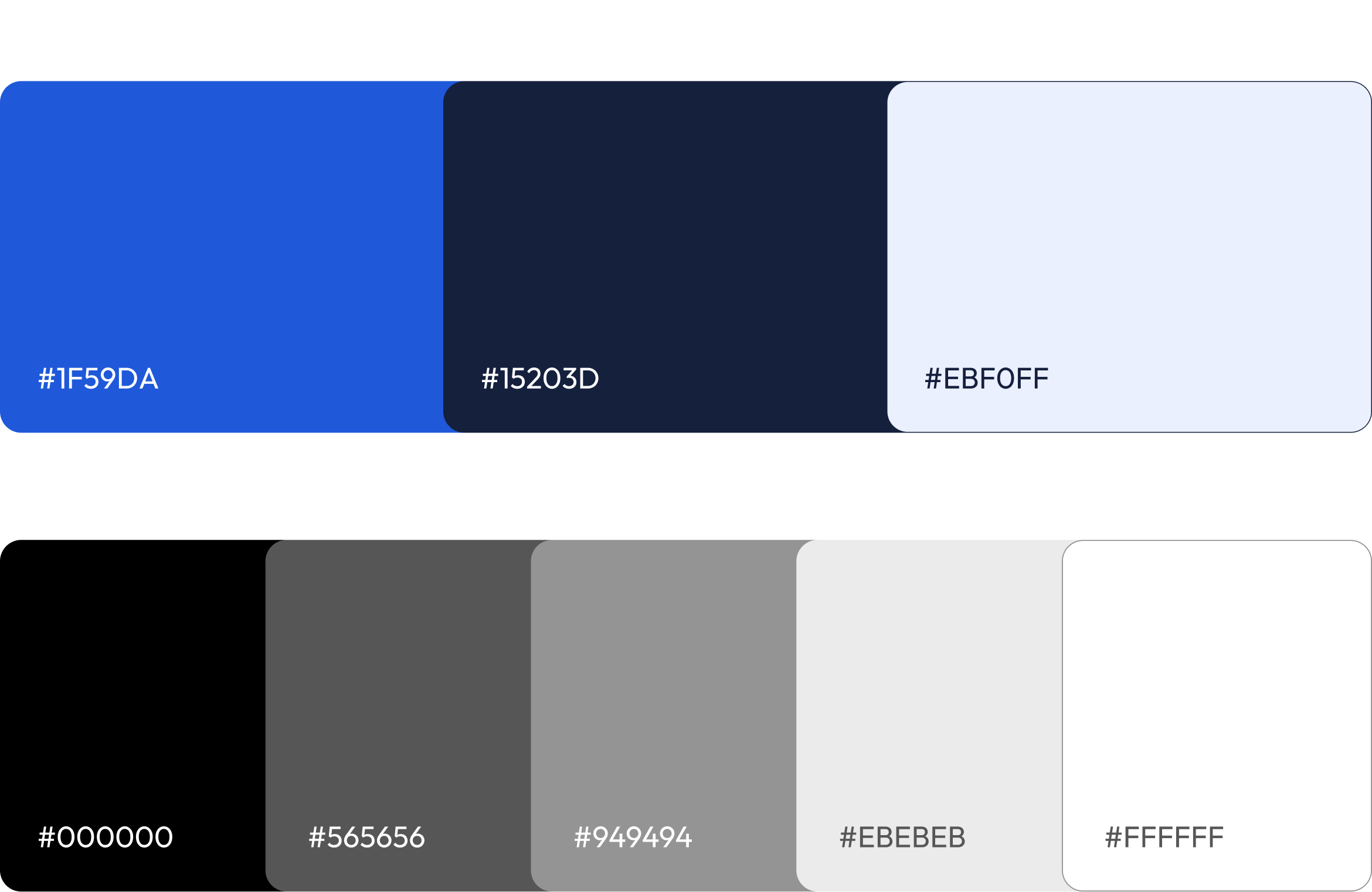
Colours
Logo

Icon Grid & Mockup
UI Kit
High Fidelity Designs
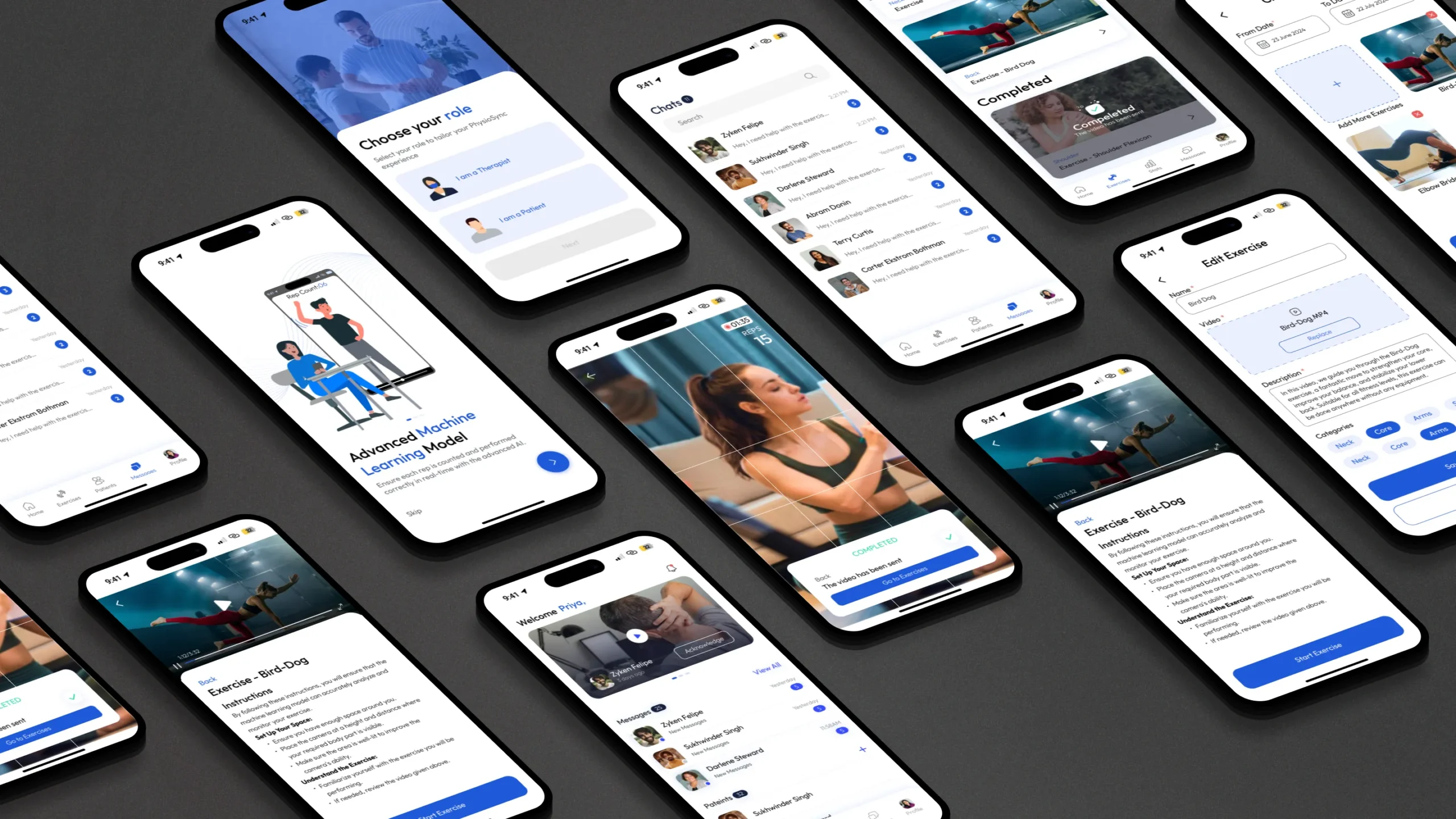
Patient Screens
Sign Up and Onboarding Screens
The app’s onboarding is tailored for physiotherapists and patients. After login, users select their role, triggering a personalized experience with illustrations highlighting relevant features.
Patient Exercises Using Machine Learning Models
Patients can perform exercises assigned by their therapist, with machine learning models providing real-time guidance through voice commands and accurate rep counting.
Apple Watch Health Stats for Patients
Apple Watch integration allows Patients to monitor their calories, heart rate, sleep, and steps. These health stats provide valuable insights for both patients and their therapists.
Physiotherapist Screens
Notifications & Video Acknowledgement
When a patient completes an exercise, the therapist gets a notification to review the video. They can acknowledge it directly, and the patient is notified. If needed, the therapist can privately respond to any concerns.
Chat Screens
The chat feature enables patients and therapists to communicate directly, resolving any exercise-related questions or concerns without needing a call or waiting until the next appointment.
Add New Patient
With simple, intuitive steps, the physiotherapist can easily add new patients to their database and include patient history for future review.
Adding New Exercises to the Library
The physiotherapist can easily add new exercises by uploading videos and providing written instructions.
Creating Exercise Schedules for Patients
The physiotherapist can effortlessly create an exercise schedule for the patient using their exercise library, simply by adding exercises and selecting the dates.
Marketing Assets
We successfully launched and showcased our innovative app at the UBC Robson Square Auditorium.
To generate excitement and drive attendance, we developed a comprehensive marketing campaign featuring engaging flyers, eye-catching posters, and compelling short and long-form videos. These assets effectively communicated the app’s unique features and benefits, contributing to a successful event.
Watch our live presentation :
Learnings & Takeaways
User Feedback During Waiting Periods
I learned that providing meaningful information during potentially frustrating moments, like video uploads, significantly improves user satisfaction. This reinforces the importance of keeping users engaged and informed throughout all processes, even when the app is performing background tasks.
Clarity in UI Elements
The confusion around icon functionality highlighted the need for clear, unambiguous UI elements. I found that while minimalist design can be aesthetically pleasing, it shouldn’t come at the cost of user understanding. Balancing visual simplicity with clear labeling or tooltips is crucial for intuitive navigation.
UX Design Extends Beyond the Screen
When users struggled to keep track of their reps away from their phones, it hit us – good UX isn’t just about what’s on the screen. We realized we needed to think about how people actually use the app in real life, not just in perfect conditions. This led us to explore options like voice feedback, showing that sometimes the best solution isn’t visual at all. It was a wake-up call to design for the messy, unpredictable ways people might use our app, and to be flexible in how we deliver a smooth experience, whether they’re looking at the screen or not.